Design
Rapidly build beautiful and accessible experiences. The Carbon kit contains all resources you need to get started.
Get the kit
1. Install Sketch.
To design with Carbon you must have the most recent version of Sketch installed.
2. Choose a theme.
There are four Carbon themes, two light (White and Gray 10) and two dark (Gray 90 and Gray 100). Each theme lives in its own Sketch library. You can subscribe to as many libraries as you’d like.
3. Bring in additional colors and icons.
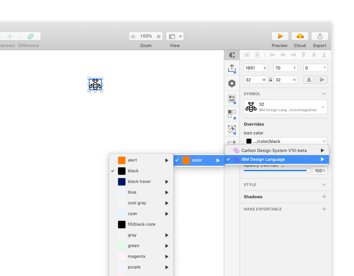
The full icon library and additional color collections live in the IBM Design Language library.
4. Download the grid templates.
Visit the Sketch library page and choose Download Document from the right-side panel.
Open the file in Sketch. Navigate to File → Save as Template. You can now access the saved grid template at File → New file from Template.
Start designing
To get started with Carbon, familiarize yourself with the contents of each library.
Start with the grid.
At the top of your screen, navigate to File → New file from Template and select your grid template. You’ll always be able to find the template here.
Icons and color swatches.
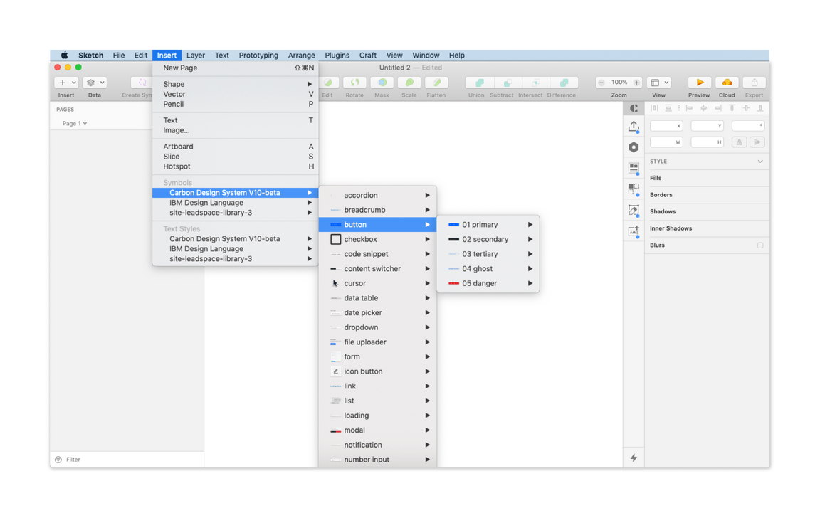
Symbols from both the IBM Design Language library and the Carbon library are accessible from any Sketch document. Navigage to Insert → Symbols → Carbon Design System or IBM Design Language.
You’re all set.
Refer to the content below for a more detailed breakdown of the kit, or head to Sketch to begin designing.
Anatomy
See the Sketch library page for an overview of the kit.
Grid
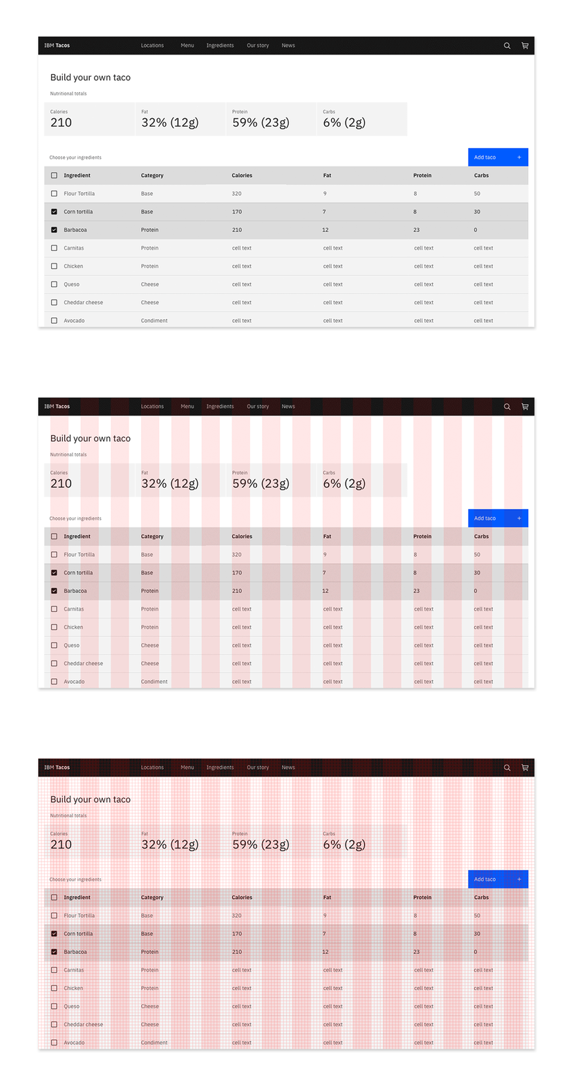
The IBM 2x Grid is the framework for laying out all visual elements in Carbon.

2x Grid overview
All designs should start with the 2x Grid template. Once you have saved the grid as a template, navigate to File → New file from Template and select the grid template.
See our layout guidelines for a more detailed walkthrough of the 2x Grid.
Structure
The grid template includes templates for all breakpoints along with the necessary formulas to design for custom screen sizes.
To toggle the grid on and off, use Control+G. To toggle the layout guide, use Control+L.
Symbols
Carbon components, add-ons, and icons live in the design kit as Sketch symbols.

Library menu navigation
There are two kinds of symbols — library symbols and document symbols. Library symbols are available in any Sketch document, while document symbols are specific to the document in which they are found.
From the Insert menu, select Symbols → Carbon Design System to add symbols onto your page.
Carbon symbols are built to be flexible, and designers should not detach symbols from the library. Once a symbol is detached, you will no longer receive updates as they are released.
Structure
Symbols are organized by component; after selecting a component, you’ll see the variations and states of that component.
To add the whole component, select the desired variant and place it on your artboard.
For even more configurablility, use the individual building blocks found under the
Itemsfolder within the symbol. Be sure your custom design adheres to our design guidelines.
Text styles
Text styles are based on typography rules defined by the IBM Design Language.

Library menu navigation
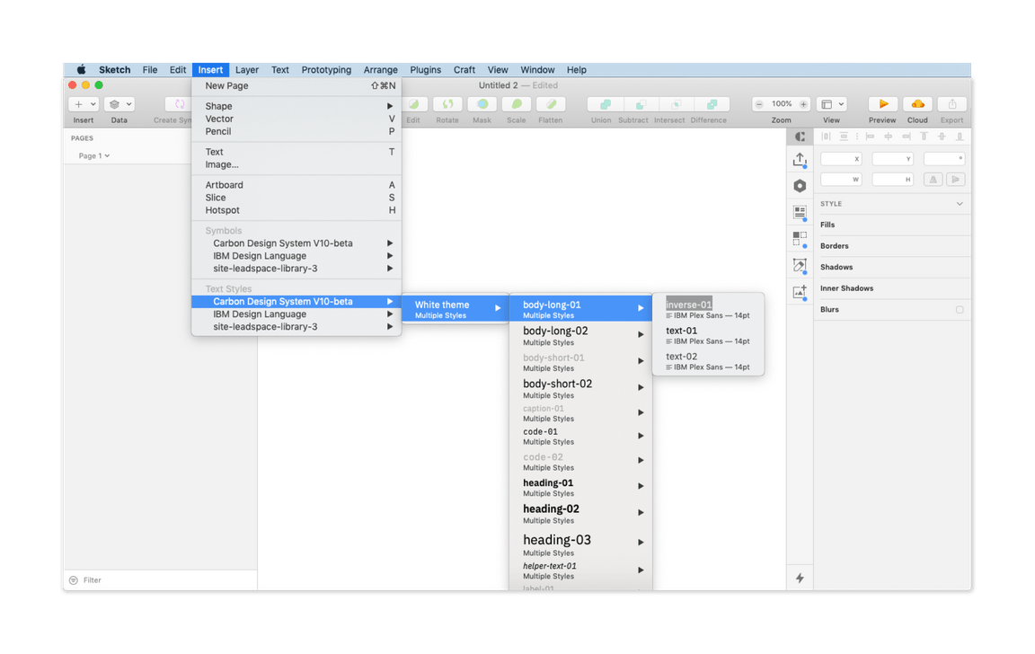
From the main menu select Insert → Text Styles → Carbon Design System to insert a Carbon type token text style.
Text styles within components are carefully considered. We do not recommend detaching the symbol to change default styles.
Structure
Carbon text styles in Sketch are organized similarly to symbols.
- The first text style level displays theme options (i.e., white theme).
- The second level shows the Carbon type tokens (i.e., body-long-01).
- The third level selects the type color, which is labeled with a Carbon color token name.
Layer styles
Layer styles are color selections for any shape in Sketch.

Use predetermined overrides when possible
Library menu navigation
Color in Carbon is carefully considered, and we discourage custom layer styles.
The first layer is the theme selection (i.e., 01 White theme). The second layer is core Carbon color tokens (i.e., field-01) for the selected them. The interaction state tokens are nested in a third layer under “state”.
Info
If you’re brand new to Sketch, they offer some great tutorials and help docs.
Updates
We make small adjustments and bug fixes to the kit on a regular basis. When we make a change to any of the libraries, you will be notified via a red pop-up in the top right corner of the Sketch window.
The updates are opt-in, however we recommend you keep your kit as up to date as possible. Once a change is accepted, you will not be able to revert to the previous version.
Migration
If you’re using an older version of Carbon, check out the v10 migration docs when you’re ready to make the switch.
Support
Can’t find an answer to your question? Open up an issue on GitHub.